Churn
When we have finished analyzing your default branch, you will see churn metrics for the files in your repository. This churn metric is approximately the number of times a file has changed in the last 90 days, calculated by counting the number of distinct versions of that file across commits from that time. The absolute value won't be as useful as comparing the values across files - which files change most often, what are their relative qualities, etc.? Quality issues can have a greater impact on files that churn frequently, so high churn, low quality files should be top candidates for attention.
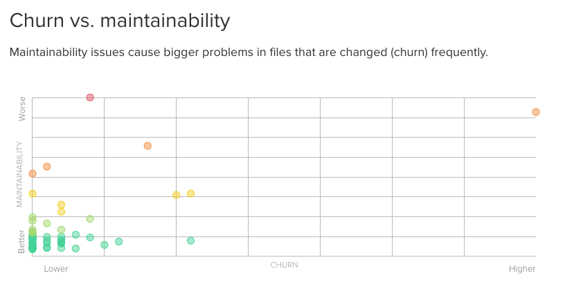
You'll find your repo's Churn vs. maintainability chart on your Trends page:

As mentioned above, it can be useful to identify high churn, low quality files within a repository. The x axis of this graph is the churn of the file - lower, or left, is better. The y axis is the quality, plotted by remediation cost (how long it will take to improve the file) - lower, or bottom, is better.
Hovering over a plotted point gives you the name of the file. Clicking on a point will take you to that file's issues.
Related Issues
Updated about 1 year ago
